So we built a small visual generation engine that turns those raw numbers into branded, polished visuals.
The goal: a repeatable, fully automated workflow that lets us post high-quality F1 graphics in seconds — without manually opening Photoshop ever again.
From raw telemetry to Instagram-ready visuals
Here’s what happens behind the scenes every time we publish a new Formula.Graphic post:
- Fetch the data
Using FastF1, we load race or qualifying sessions, caching the results locally for speed. - Process the laps
For each driver, we collect lap times, sector splits, and optionally telemetry like speed and throttle. - Apply our visual template
A minimal Matplotlib style: custom colors, typography, spacing, and corner-labeling consistent with our brand. - Render and export
We export the image at 300 dpi, ready for upload — or batch-generate several for automation pipelines.
The FastF1 foundation
If you’ve never used FastF1 before, it’s a lightweight Python package that lets you load live-timing data directly from the F1 timing feeds.
Here’s the quick version:
pip install fastf1 matplotlib pandas
Then, enable caching (so each session only downloads once):
import fastf1
fastf1.Cache.enable_cache('cache')
Now you can instantly pull data from any session - for example, Monaco 2024 qualifying.
Building your first Formula.Graphic-style plot
Below is the exact minimal script we started from. It produces a clean lap-time visual for one driver. Copy, paste, and run it - no API key or credentials needed.
# formula_graphic_demo.py
import fastf1
from fastf1 import plotting
import matplotlib.pyplot as plt

# Setup
fastf1.Cache.enable_cache('cache')
plotting.setup_mpl()

# Custom visual style (Datastudy style)
plt.style.use('seaborn-v0_8-darkgrid')
plt.rcParams.update({
    'figure.figsize': (10, 6),
    'font.family': 'sans-serif',
    'font.size': 12,
    'axes.edgecolor': '#222',
    'axes.labelcolor': '#222',
    'text.color': '#222'
})
DRIVER_COLOR = '#FF1801'  # Ferrari red, adjust to taste

# Load a session
session = fastf1.get_session(2024, 'Monaco', 'Q')
session.load(telemetry=False, laps=True)

# Select driver and laps
driver = 'VER'  # Max Verstappen
laps = session.laps.pick_driver(driver).dropna(subset=['LapTime'])

# Plot
plt.plot(
    laps['LapNumber'],
    laps['LapTime'].dt.total_seconds(),
    color=DRIVER_COLOR,
    marker='o',
    linewidth=2,
)
plt.title(f"Monaco 2024 Qualifying – {driver}", pad=20)
plt.xlabel("Lap Number")
plt.ylabel("Lap Time (s)")
plt.grid(True, alpha=0.3)

# Export
filename = f"formula_graphic_{driver.lower()}_monaco.png"
plt.tight_layout()
plt.savefig(filename, dpi=300)
print(f"✅ Saved: {filename}")
plt.show()
Why this approach works
This method hits the sweet spot between engineering and design:
- It’s fully reproducible — every visual comes from the same pipeline.
- It’s data-driven — no manual graph tuning.
- It’s scalable — we can process every race in one command.
- It’s brand-consistent — same fonts, same layout, every time.
Once you define your color palette and export logic, you can easily expand this script into:
- A driver comparison visual (overlaying two telemetry traces)
- A sector analysis view
- A top-speed vs lap-time scatterplot
- Or even a video pipeline (using FFmpeg to animate the laps)
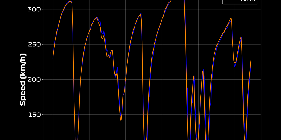
Our template background looks like this:

The result
We now generate Formula.Graphic visuals directly from FastF1, feed them into our automation pipeline, and upload them to Instagram with zero manual work.
Every plot follows the same branding template - clean, minimal, and informative.
It’s a perfect example of how data engineering, design, and automation meet halfway.
Try it yourself
You can fork this setup, tweak the colors, and build your own visual identity on top of F1 telemetry data.
If you’re running multiple sessions or want to automate posts, add a small scheduler or integrate it with a Flask API.